 With the image enlarged, you can use the 'Magic Wand' to select the centers of the letters and use the paint bucket (or brush) to change the black areas to white. If you use the brush, note that the brush size is enlarged the same as the image.
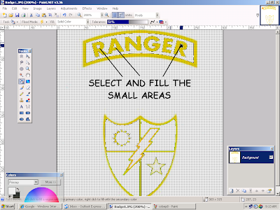
Next we will get rid of the outlines. Select a gold area with the 'Magic Wand'. Check to see if the wand included the 'phantom' outlines. It probably didn't. On the toolbar there is a box called 'Tolerance'. Increase the tolerance (by left-clicking and dragging) until the outlines are included with the gold area when you use the 'Magic Wand'. This will probably take a few tries to get it just right. Then paint the selected area black. The 'Phantom' is gone! Continue selecting and painting until all the gold areas are black. Sometimes you must work the opposite way; i.e. selecting the white areas while adjusting the tolerance and painting in white.
 You will find that even after the selecting and painting there are still some areas with poor detail. We must eliminate these so that you don't get a 'raggedy' SVG. To do this last step I use a technique that I call 'Pixel Painting'. Zoom in a couple of more steps until your image looks something like this:
 You should be able to see the individual pixels that make up the image. 'Zoom In' another step if you need to. On the 'Edit' drop-down menu click 'Select All' to select the entire image. Choose the brush size to be 1 pixel. Now you can add black or white pixels (one pixel at a time) to fix all the little problem areas that will show up on your final cut. You will have to use the scroll bars to move around the image to make sure you haven't missed any bad spots. When you are done, 'Zoom Out' to normal size. Your image will be improved and contain only black and white (a perfect silhouette) and should look something like this:
  Now save your image so you can convert it in Inkscape.
  When you trace the bitmap in Inkscape select 'Brightness cutoff', set the threshold to about .650 - .700, and uncheck 'Smooth' (to give you sharper corners). Save your file and that's it! The gold part of the 'Badge' image is ready to cut. Now use the same techniques to make a silhouette of each of the remaining colors.
REMEMBER - Make a silhouette of each color and don't be afraid to experiment. After you have done some images you will be able to separate the colors in just a few minutes. For the best results we always start with the largest image we can.
GOOD LUCK AND HAPPY CUTTING!!


No comments:
Post a Comment